Friday, 27 November 2009


Antwerp, Video Takeout Depot

Skip the blockbuster feelings. This store is a great example of a low cost and simple way to develop a video/dvd takeout. With additional food and drinks to make the film experience at home more enjoyable positioned in the most simple stack system you can think of, this concept screams; personal and specially picked for you. In the back is a big wall with a huge library with all the film classics.

Although this industry might suffer a lot from the internet, this shop shows how you can make it still worthwhile to go to a real store. Here shopping is an experience in itself and has an added value.

Antwerp, Homeland Sissy Boy

Sissy Boy clothing started a home-line a few years ago. This new Antwerp store is a combination of these two collections. Question: What do they want to sell, the clothes or the accessories?

The success of this combination relies very much on the impulse shopping behavior. If you’re not located in a street and place with lots of traffic, it becomes very difficult.

With what product in mind do customers come to this store? Clothes? Home furnishing? Gift ideas?

Although the store interior is nicely done and gives a good combination between industrial and classic elements, the Sissy Boy concept itself could be much stronger in their positioning. This is more a compromise than a deliberate choice. The clothes are too basic as the home ware is inspirational and in this case clearly overwhelming the clothes collection. May be they should take a closer look at a very successful example from the states and their new flagship store in London; Anthropology
Antwerp, Shoe store

How simple can it be? Less is more.

Beautiful shop window


Antwerp, A find

Sometimes we find these little pieces of art on the street: planned or lost?


Antwerp, Mmmmh!

Attractive shop window, it turns out to be a space for workshops, products, recipes, books and products for and around the experience of cooking.

When trying to get in to take a closer look we noticed; ONLY open during the workshops?? A missed opportunity to sell during other moments specially when you have taking the effort to really develop a brand with a private label that could be great gifts for cooking lovers. A missed opportunity to become the preferred destination for knowledge AND products for cooking, eating and drinking, creating new retail.

Antwerp, LXP

A great concept for renting (and buying) 2nd hand couture and high-end fashion. It’s set in a couture environment and works on appointment. With the total dress-service (including shoes, accessories) you leave the store feeling like a million bucks.

Antwerp, Julija

Knitwear shops are rare to find and when you do find them they do have this outdated feeling. Actually is this a strange phenomenon as knitwear itself is such a big part of fashion collections nowadays.

A nice surprise is Julija, a knitwear shop in a setting that screams fashion.

The shop is modern in it’s approach. The natural tinted shop environment acts as a blank canvas for all the different wools and fabrics and ideas pop up!


Antwerp, Hospital

It’s always interesting to see a new store concept.

This multi brand store has the same owner as Clinic, opposite in the same street but his store is set up with a higher fashion level in mind, with labels like Sonia Rykiel, Victor & Rolf, Paul & Joe, Camper special editions etc.

The store is a big open space, with a center element consisting more levels, all in wood.

Hospital gives the impression that the store is clean and distant, it lacks intimacy. The interior design as taken over the message…..

Antwerp, A.Boon

A beautiful and still traditional shop front and interior specialized in gloves.

It’s like time stood still but in a growing retail market, specialization is one of the keys to success. An unique, old store like Boon can become and stay successful when it sticks to what it knows best: everything about gloves!

Antwerp, Mauquoy

This engraver has a clear display of the service and products on offer.

The display=the shop=the shop window.

Antwerp, Fritz Hansen

Arne Jacobsen’s Butterfly Chair is an icon. This wall display shows the design and

color in a very strong way.

Antwerp, Elsa

Who doesn’t know Elsa. A selection of quality women and men shoes. In the middle of this store are low tables that are both used for display as well as the place to try on their shoes.


Antwerp, Donum

There are lots of ways in presenting products and collections. Being a big store it’s often difficult to keep an eye on all your small or exclusive product ranges. Working with this well-illuminated wall cabinet gives the store a good overview of their collection and at the same time creating an exclusive feeling.

Antwerp, American Outfitters

Simple and surprising store design:

Another way of placing the racking in a store


Antwerp, Cheese store

A beautiful selection of all kinds of cheeses, triggering all your senses.

Very nice detailing in interior design and check this very small counter! (left photo).

This custom made store gives a unique approach to customer contact working without a noticeable counter being so close to the offered product and specialist shop staff, that gives great advise and service.


Antwerp, ALL SAINTS

A good example of a shop where the interior is fully compatible with the presented collection; rock-chic with an edge for young minded fashion lovers. The store is consistent in it’s choice of material and decoration given it an industrial and rough look. Although this style might not be everyone’s cup of tea, it is well executed and you can see the identity of this brand in everything they do: sharp focus and consistent implementation. By focusing on their own DNA they created a new, own place in the fashion industry.


Antwerp, A.PUUR.A

A store in it’s own kind. You have to have time to let yourself get seduced by this perfect assortment. It’s a rare combination of individual chosen products that combined together give an inspirational collection. It’s unique and based on personal taste and vision of it’s owner(s). The chosen products are presented on color themes without being standard or old fashioned. The selection is a joy for the eye and seduces you to buy. A.PUUR.A offers a divers range for women, men and children from shoes to home decoration. This very personal pick of products brings new content to the word gift shop.

Friday, 6 November 2009


Utrecht, WAAR

“WAAR” is the new concept for the old fair-trade shops, “wereldwinkels”.
New name, new website, new store design, new graphics.
The idea of using the word WAAR is a good one. “WAAR” meaning in Dutch “where”, and also “true” is strong! It reflects the idealistic background of the organization: products for a fair price, with a clear idea on where the products come from and were the right people earning a fair amount of income.
The new graphics in the store reflect this by asking the consumer:
“Do you know what is “WAAR” (where/true)?”
“Prices include a good story.”
The only big problem with this store design is that there is no place to communicate with the consumer about the questions, you’re kind of left in the dark. Products are placed without any background information and if there is an explanation it doesn’t tell you what you would like to know. Really a big opportunity to involve the consumers is left out: in our opinion a huge disappointment. Questions are raised but not answered; involvement is not created in the store.

Utrecht, Vanilia

Taking a closer look at the Dutch Vanilia concept; it’s to be noticed that their stores are always located in beautiful old buildings. This instantly creates a good atmosphere as soon as you enter the store. The store interior itself is a nice mix between old and new.
The brand focuses on the modern women offering 3 different collections for 3 different moments of use, ranging from casual trendy to smart business.
A great asset is the spacious dressing rooms and, in this case, adding a place to sit nearby gives an excellent interaction between consumer and store staff. The table can be used as a display showing different options on one outfit and encourages added sale. The atmosphere they offer is relaxed which helps spending more time in the store and being seduced in buying more than you came for.
Utrecht, Invito

Looking more closely at shoe stores a few things are worth mentioning. Product lighting is often a problem. This shoe shop has a simple solution by putting the light in the shoe wall above each shelve. Besides that they are flexible in their way of selling shoes and boots. The shelves are adjustable in height (including the light), so with the change of shoe trends they can fit different sizes of shoes or boots and keep an optimal presentation. A very effective focus on shoes.

Utrecht, Dille & Kamille

Utrecht, Zeeman

Great ad! You are intrigued and want to know more.
Hopefully this is the beginning of new consumer communication and store design, just hope it doesn’t stay by this advertisement only.
Utrecht, Sacha

Sometimes you see a trend and you think nothing else than; NO !
Fur-trimmings might be a trend this season, but does this dead marmot really have to be on everything?
Utrecht, Men at Work

The shop windows of ‘men at work’ are always a joy to look at. The company puts a lot of effort in sending a consumer message in a creative and for the Netherlands new way. Definitely trying to create ‘stopping’ power! Unfortunately in this case, they tried too much at the same time. The shop windows are in a nice autumn theme with, as an effective feature, the carpet running through! The mid front presentation is a very well executed one on it’s own right! Only now the windows over power the mid front presentation and vice versa. To focus on one communication item would have created a better stopping impact for customers with a clear focus on either the denim offer or the autumn theme.
Utrecht,America Today,

Some Dutch retailers are copying the store design of Abercrombie & Fitch: America Today, Scotch & Soda, Geddis & Gilmore to name a few. All use the same ‘inspiration’, some succeed in transferring the inspiration to their own DNA others are less successful. Sad to see that a concept as America Today, that has so many “Unique Selling Points”, is changed into something with so little identity.

Friday, 16 October 2009

Bilbao, Food Stores

Food display is always interesting to look at, as it simulates your senses immediately!

It’s fascinating to see different countries, with their own specialities, presented in their own way.

Bilbao, Clothing Stores

Different countries have different ways of presenting. They use the principle of a market booth; no window, lots of products. You need to get in to get an answer. Smart way to draw people into your store.

Who says you need shop windows to attract customers?

Bilbao, Shoes Store

Shopwindow=Store

All shoes available are shown in the shop window. Inside the store are only seats to try the shoes that you’ve selected from the shop window.

Thinking about shoes I can only say that there are more countries that sell like this than the stores we are used to in the Netherlands. What’s better? The only thing we can see is that this type of shop doesn’t say anything about the retailer. They are just a transfer station or service station for a certain type of shoes. No emotion just functionality.

Cadiz, Ties & Shirts Shop

A small product range is very well displayed. Beautiful build up colour scheme that show in a blink of an eye the full range. Easy shopping for people with limited time.

Friday, 9 October 2009

Den Haag, COS

This beautifully mid prized design store offers great clothes for men, women and kids.

Great quality fabrics, special design. Spot on design translations. Next to the special collection, they offer good basics. Their windows reflect the collections they sell.

Trend, design, no fuss, natural fabrics, value for money.


Den Haag, Maison de Bonneterie

Entering the new ‘Masion de Bonneterie’ you walk from "shop in shop" into "shop in shop". All the relevant more traditional brands are there, unfortunately nothing really stands out. The store is turned into a place for brand lovers. It’s become more general than special, one can find this in the product choices as well.

First example:

The turned up collars are a great solution to show detail that add surprise, a compliment is in place.

Example table presentation:

Although the colour group is correct and safe it misses a sparkle.


Monday, 14 September 2009

The way to go !

www.monocle.com/sections/edits/Web-Articles/Shop-Idols


Five brilliant examples on how to survive all trends by creating unique retail that's based on passion for product and the drive to offer the best. The result will be that your place stands out from the crowd and can stand the test of time, creating an unique environment, where people feel welcome and can be themselves, sharing the same love for the things you sell.

Everybody wants to be unique.

Saturday, 12 September 2009

Breda, Zara


Zara has very flexible store-fixture. In each unit you can hang the clothes in several ways, front-facing, side-facing or a combination. This makes it easy to change and easy to add interest. One unit is repeated several times, with little adjustments, but the width is the same. This way it is easy to create one visual merchandising standard for all stores.

Utrecht, Wanted: Knitting ladies, www.i-did.nl


After lot’s of developments with slow food, there’s slow fashion.

Wednesday, 9 September 2009

Amsterdam, Laura Dols

A beautifully sorted linen-room in a vintage store
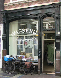
Amsterdam, Laundry Snowwhite

The presence of this kind of shops makes the shoppingstreet more interesting.

Friday, 4 September 2009

Amsterdam, Reypenaer


A fabulous concept for cheese. Entering the store, you find a selection of cheeses, that you can taste and smell, all presented on a table, made of oak. On the wall are pictures and movies of the cheese factory in Woerden. Going to the basement is a tasting room, behind small desks you can experience the taste of cheese. The whole interior gives the feeling of an old canal houses. Spokesman for the store is Ron Pieters, cheese master and wine connoisseur, who takes you by the hand to experience cheese and the products they sell. His enthusiasm is very contagious and in our view that’s the best way to sell.

We believe this personal touch and eye for detail has the future !


www.reypenaer.nl

Friday, 14 August 2009

Tilburg, Museum De Pont


The library in the museum is an example of how our future office should look like. An absolute wanna-have !

Tilburg, Museum De Pont


This lighting sculpture by Angela Bulloch would be a great feature in a store.